
Retro Vibes
Designer Jennifer Pizzitola helps her clients create a home packed with personality.
Conversation with JENNIFER PIZZITOLA | Written by ANN KAISER
Images by JACOB SNAVELY
Two Brooklynites were looking for a suburban upbringing for their young family. The town of Westport, CT—with its laid-back lifestyle and proximity to the outdoors—offered the change they were seeking.
Finding the right house, however, was a bit more of a challenge. After looking at numerous properties, they finally located one that appeared to be uniquely suited to them. “We immediately could see our family living there,” says the husband. “It felt like an ‘80s Hamptons beach bungalow or ski house in Vermont.” The previous residents had spent several decades there, and over the years they had put their own unique spin on the house. The vibe resonated with the new homeowners. “They had made it cool, quirky, funky—and we wanted to continue that,” says the wife.
Even as the new owners made some changes to suit their lifestyle, “we could feel the home had a soul, and we wanted to be good stewards of it,” the wife continues. The couple hired architect Christian Rae Studios to help execute their vision—one that unexpectedly expanded in scope after a burst pipe turned the original smaller-scale plans into a gut renovation. Then they brought in designer Jen Pizzitola of JDP Interior Designs to help pull it all together.
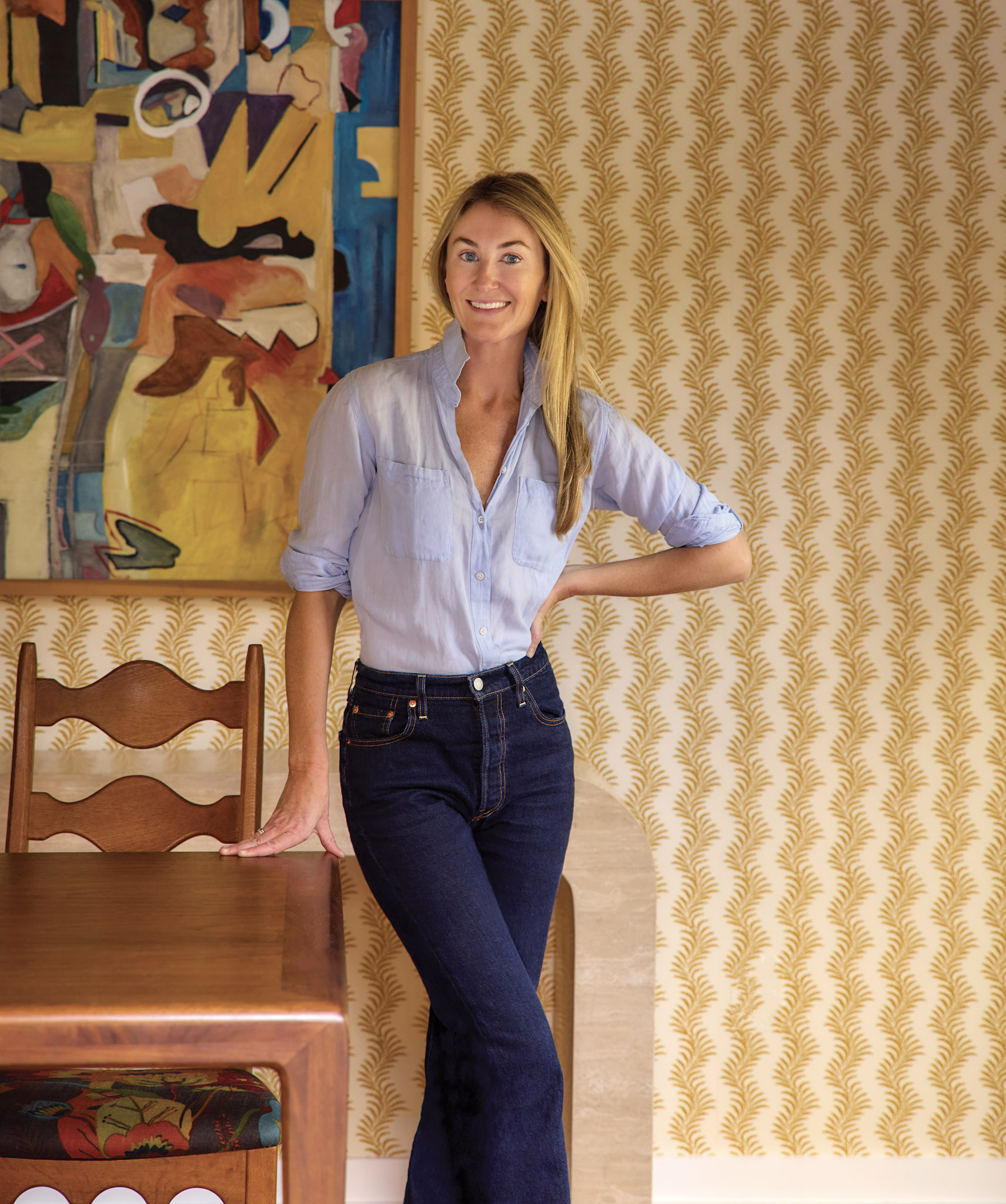
“I’m very boutique, and my clients often find me by word of mouth, which leads me to good, interesting people,” says Jen. “This was a very fun project—these clients are very cool, and I loved that they wanted to put their own stamp on their home.”
Both the designer and the clients like clean, mid-century silhouettes and the mixing of old and new. Though this project presented an opportunity to go a bit bolder with color than Jen typically does, personalization is very much part of her ethos. “I like each project to feel different because it’s a different family and a different physical home,” she says. “It’s a very collaborative process for me; I like things to look curated.”
The homeowners were seeking spaces that were playful, but not very precious. “We wanted it to be comfortable, but also engaging and interesting,” says the wife. With three young kids and a city sensibility, “they like things to have a point of view and to be fun, but they’re also practical,” says Jen. The art they’d collected together over the years provided a jumping-off point to talk about their style and aesthetic. Jen “totally got it,” says the husband.
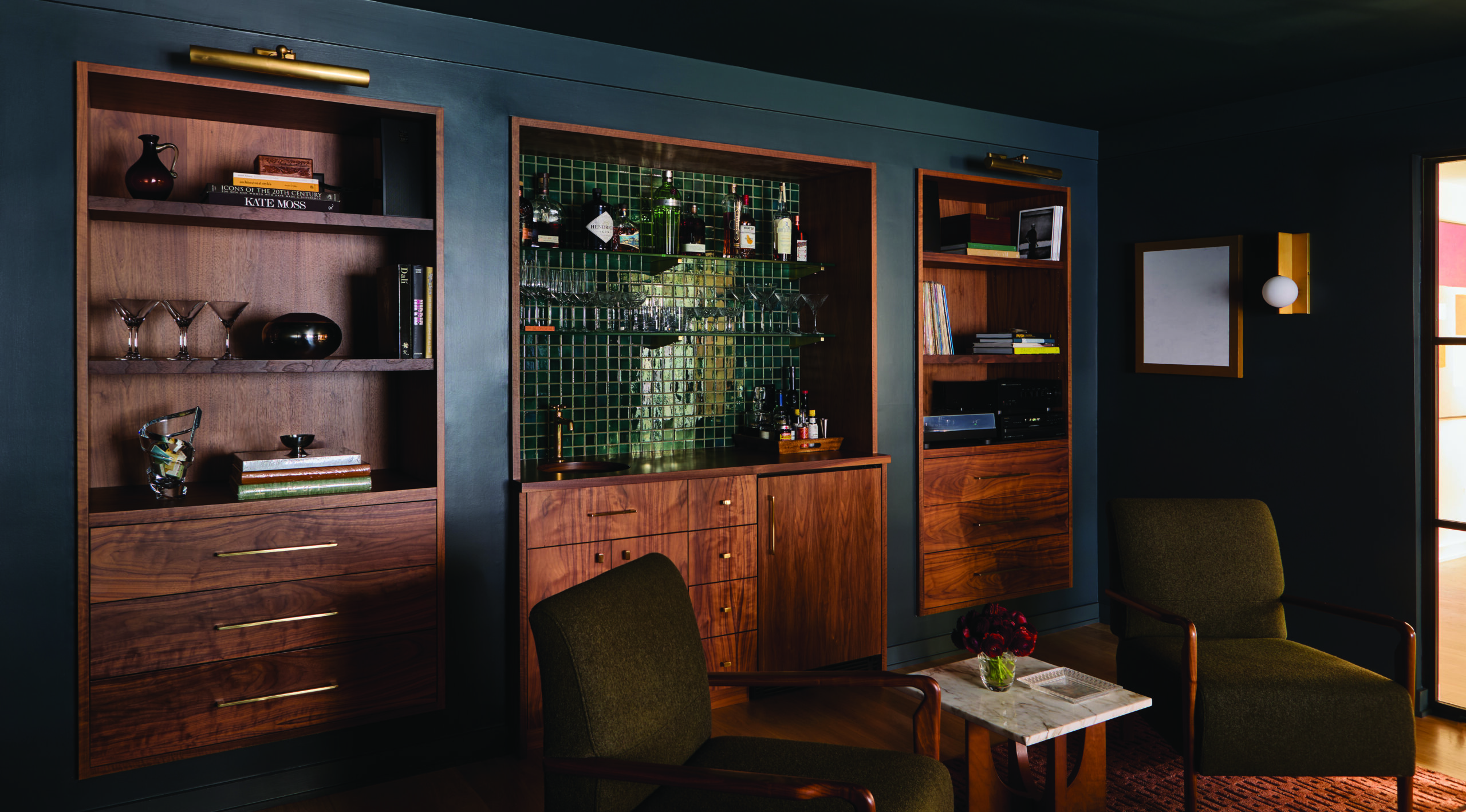
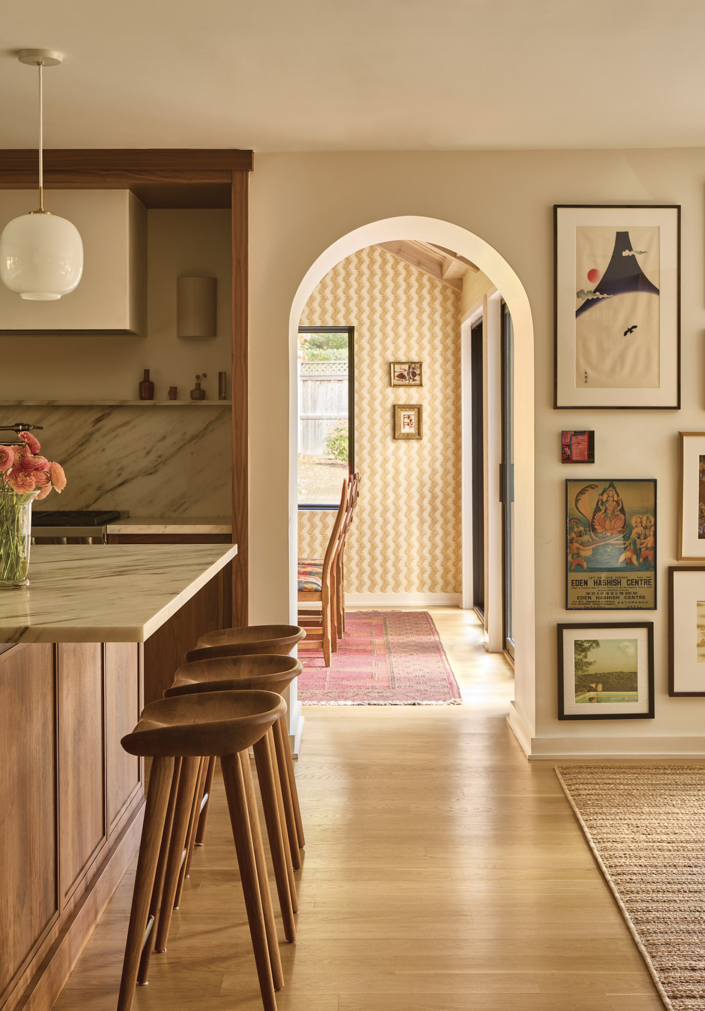
Keen on working with color, the clients liked the idea of leaning into retro hues in keeping with the 1980s design of the house. Jen helped them choose the right moments to dial it up to make sure it was something they could live with for a long time. She built upon the large family room’s existing foundation of natural light and wood with a pair of deep-seated sofas in an earthy green. For the bright, fun dining room, she started with a zigzag wallpaper in a mustard colorway, and added a durable dark-wood table and ladder-back chairs reupholstered in a funky fabric. The bar room, accessed through glass-and-metal doors, was intended to be more of an adult space, so Jan leaned into a darker palette of Benjamin Moore’s “Narragansett Green” on the walls and a rich boiled wool for the pair of upholstered chairs. Though it’s got some punch, “it’s not eclectic or whimsical—it’s elegant color,” says Jen.
Wood tones are also very much part of the palette. The clients loved the existing cedar ceiling in the family room, and Jan kept that throughline with a vaulted cedar ceiling in the dining room as well. The tones of the kitchen’s walnut island and cabinets are echoed in the veining of the honed marble used for the countertop and backsplash. The original mahogany front door adds playful personality, and the existing oak staircase provides some definition to the mostly open-concept first floor, but with a more streamlined look and extra storage space tucked in underneath.
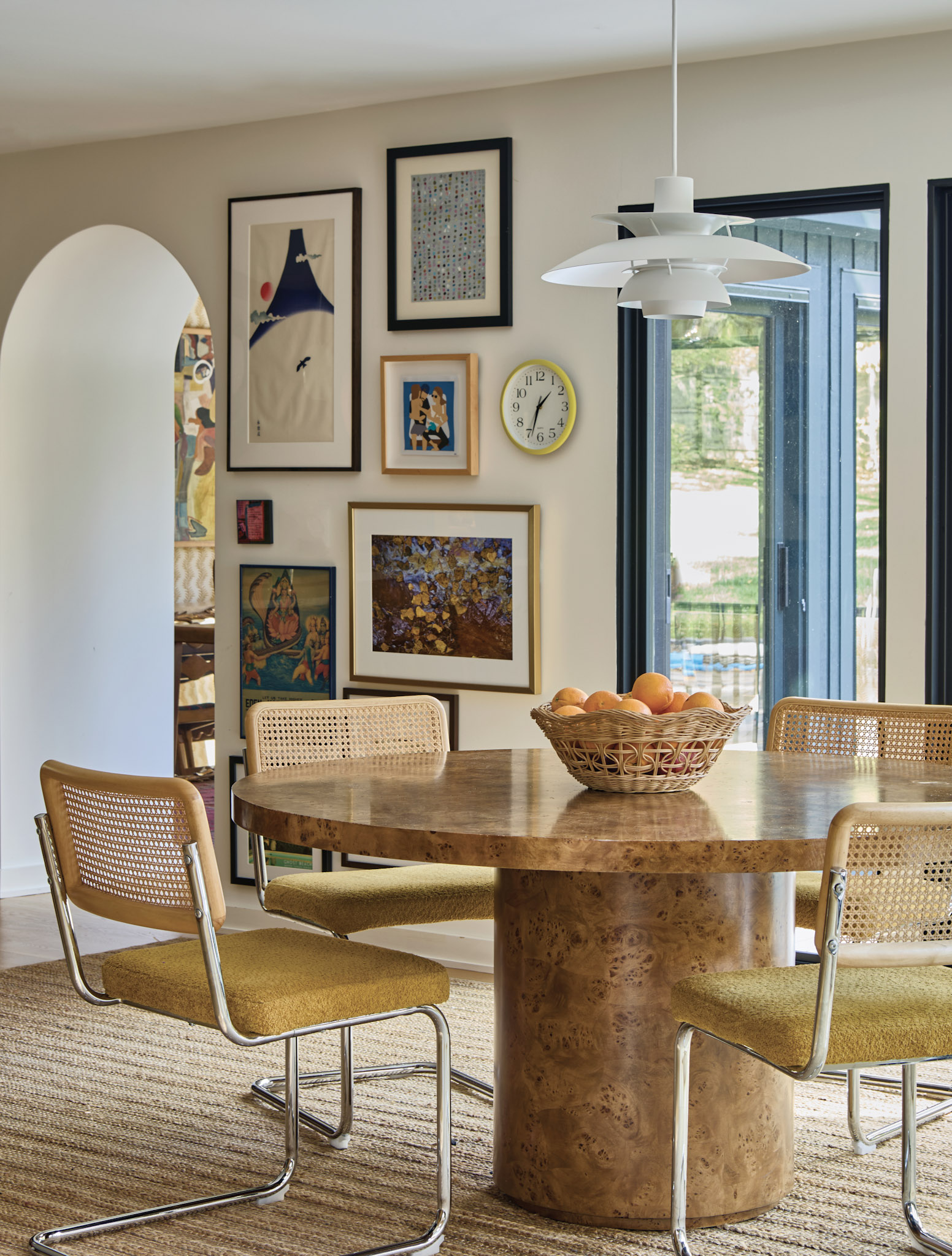
The breakfast nook offers another space with flexible seating, and features some of the couple’s collected artwork cascading down a wall. It’s one of the many vantage points the clients love. Since the house is fairly open-concept, you take in the rooms together—something these former apartment-dwellers are used to. “Every angle is very special and thought-through,” says the wife. “Anywhere you sit, the colors and patterns all play off each other very well.” Adds Jen, “There are so many great sightlines and passageways—every direction you look, it all works.”
Jen continued the style upstairs, with walnut beams in the parents’ more minimalist primary bath, and funky green tiles in one of the kids’ bathrooms. So much thought was put into every space that the family is still discovering all the details that make the house so special. “I’m constantly surprised and delighted by these little moments and viewpoints,” says the husband. “I’m always finding something
new that I love about it.”
Resources:
General Contractor: DB Essentials; essentialdb.com; Architect: Christian Rae Studios; Architect; Easton, CT; 203-292-3090; christianraestudio.com/contact; Designer: Jennifer Pizzitola; Owner; JDP Interior Design; Greenwich, CT; jdpinteriordesigns.com
Related Articles
Related
Built to Evolve: A Home for Modern Family Living
Built to Evolve:A Home for Modern Family Living.| Written by DANIELLE PORTERWithin the Grey Oaks Community in Naples, Florida, architecture settles easily into a lush, coastal landscape. It is here that this reimagined residence unfolds as a study in balance, between...
HOME IS A FEELING:
Exceptional design begins long before colors, furnishings, and finishes. In this Expert Advice feature, Alex Thies of Adelyn Charles Interiors explores how understanding the way clients live, gather, and experience their homes creates spaces that are not only beautiful, but deeply personal, functional, and timeless.
An Evolution of Old Greenwich
An Evolution of Old GreenwichWhere modern architecture, art, and landscape come into quiet alignment, shaping a home designed as much for living as for looking.A conversation with ARTHUR DUNNAM and KELLY ZERBINI | Written by DANIELLE PORTERImages by: Nick...